 Henrique Matos
October 25, 2026 · 3 min read
Design slop is a lack of decisions
Banner: Georges Seurat, A Sunday Afternoon on the Island of La Grande Jatte (1884–1886), Art Institute of Chicago. Thousands of dots, none placed by accident. Public domain, Wikimedia Commons.

This week I posted a 12-second video cleaning up the menu in Menu Online, the digital menu I built for restaurants. I didn't change colors, fonts or layout. I changed six spacing numbers. The menu went from "made by AI" to "made by someone". That's what this post is about: design slop isn't AI's fault, it's a lack of decisions.
What design slop is
You've seen it: white background, purple gradient, Inter, three cards with an icon, a title and a paragraph. Nothing wrong, nothing broken, and nothing anyone remembers five minutes later.
It became such a common look in AI-built products that it got a name: "AI slop".
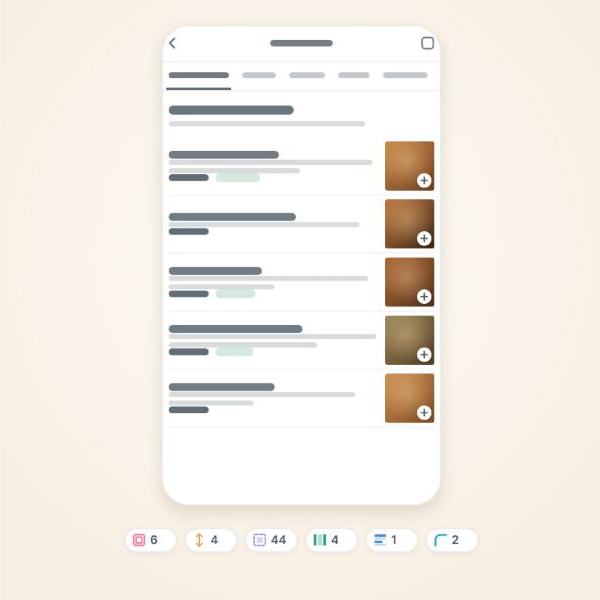 Before: the menu as AI delivered it. Frame from my video on X
In my menu, the slop wasn't in the colors. It was in the density: small thumbnails, rows stuck together, nearly square corners. Everything worked, but the screen looked like a spreadsheet of dishes.
Why AI converges on the same place
Oscar Wilde wrote, from prison, a line that describes a language model better than many technical manuals: "Most people are other people. Their thoughts are some one else's opinions, their lives a mimicry, their passions a quotation." (De Profundis, 1905).
The model learned from millions of websites and picks what's most likely. The safest choices, the ones that work anywhere and bother no one, are the most common. Without direction it aims for the middle, and the middle is everyone's average.
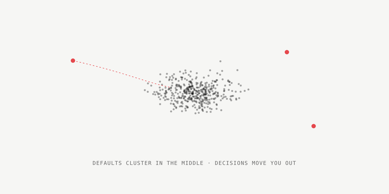 Without direction, everything lands in the middle. Illustration by the author
That's why so many SaaS products launched with AI look like siblings. It isn't a lack of talent in the model; nobody told it what made that product different.
The fix starts with spacing
Dieter Rams summed up his philosophy in the title of a book: "Weniger, aber besser" ("less, but better"), from 1995.
In the video I only touched spacing and proportion. Padding went from 6 to 16, the thumbnail from 44 to 64 pixels, the gap between rows from 4 to 14 and the corner radius from 2 to 10. Nothing new was added to the screen. Noise was removed.
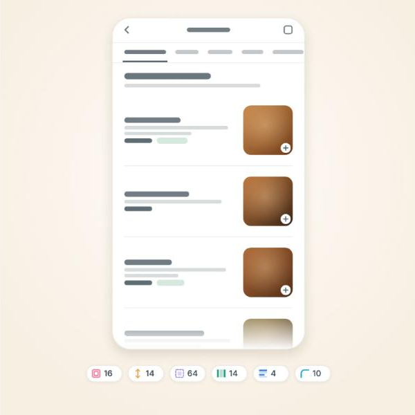 After: the same items, with deliberate spacing. Frame from my video on X
This kind of change matters because the first impression happens before reading. Someone opening the menu on their phone decides whether to trust it faster than it takes to read the first dish.
A detail only you would add
Charles and Ray Eames used to say: "The details are not the details. They make the product."
Spacing removes the slop. A detail gives identity. In Menu Online it came from the restaurants' real context: a cream background with a linen texture, tones that recall WhatsApp, where the orders arrive, and real food photos instead of generic illustrations.
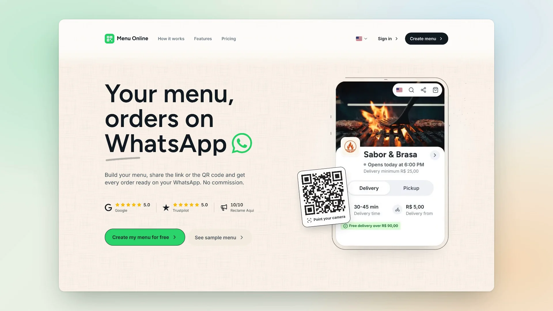 Menu Online today. Capture from my showcase
In practice, I let AI build the structure and decide three things myself before accepting any screen: the spacing scale, the typography and one detail that comes from the customer's world. The rest can come ready-made.
When it's not worth it
More breathing room has a cost: in the video, the same phone shows fewer dishes per screen. For someone who already knows what to order, density can be better. And in an MVP still testing whether anyone wants the product, polishing spacing early is optimizing the wrong thing.
Steve Jobs said it in 2003, talking about the iPod: "Design is how it works." (The New York Times Magazine).
Slop isn't ugly; it's generic. And generic disappears the moment someone makes decisions about how the product works for the people using it. AI hands you the draft in minutes. The decisions are still yours.
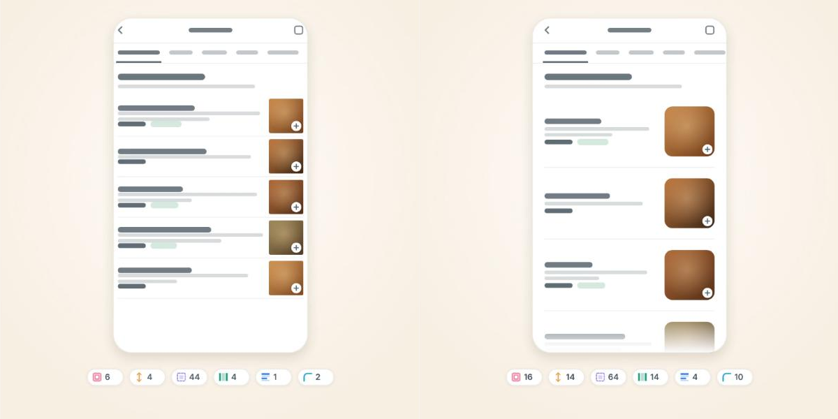 Before and after, same items. Frames from my video on X